 Pixel Ruler
- In Chrome, press Ctrl+Shift+C (Cmd+Option+C on a Mac) and point at an element. The DevTools tooltip shows its size, padding and margin in pixels.
- Outside Chrome on Windows, install Microsoft PowerToys and press Win+Ctrl+Shift+M to open Screen Ruler, which measures pixels anywhere on the screen.
- Screen Ruler counts screen pixels and DevTools counts CSS pixels. On a scaled display the ratio is window.devicePixelRatio, which the Console shows.
On this page
To measure an element on a web page, turn on Chrome DevTools’ Inspect mode with Ctrl+Shift+C (Cmd+Option+C on a Mac) and point at the element: a tooltip shows its width and height in pixels. To measure anything else on a Windows screen, install Microsoft PowerToys and press Win+Ctrl+Shift+M to start Screen Ruler. On a Mac outside Chrome, the Apple help pages we checked offer a Shift-Command-4 screenshot, not a ruler.
These tools count different pixels. On a Windows display scaled to 150%, the same box can read 100 in DevTools and 150 in a screen ruler. The ratio between the two readings is window.devicePixelRatio, which you can read in the DevTools Console.
Measure an element in Chrome with DevTools
Press Ctrl+Shift+C (Windows, Linux, ChromeOS) or Cmd+Option+C (Mac), or click the Inspect mode button in the DevTools action bar, then move the pointer over the element. Chrome’s Inspect mode docs list what the tooltip shows, depending on the element: “The element’s dimensions, in pixels,” plus its padding and margin, also in pixels.
Chrome’s pages say only “in pixels”. They do not name the kind; read them as CSS pixels, the unit of width: 100px in a style sheet.
To see rulers while you hover over nodes in the Elements panel, turn them on. Press Ctrl+Shift+P (Cmd+Shift+P on a Mac) to open the Command Menu, type Show rulers on hover and press Enter, or check Settings > Preferences > Elements > Show rulers on hover. The rulers count in pixels and let you measure the width and height of each element you hover over, per the DevTools DOM guide.
For the box model of the selected element, go to the Styles tab and click the Show sidebar button in the action bar, as the CSS features reference describes. If a style appears only on hover, select the element, click :hov in the same tab and check :hover. DevTools then applies its :hover styles “even though the element is not actually hovered over”.
Measure the distance between two points on a page
DevTools describes one element at a time. For the gap between two cards, you inspect both and subtract one edge from the other. A distance between two arbitrary points, say from a heading to the edge of a photo, has no element to inspect at all.
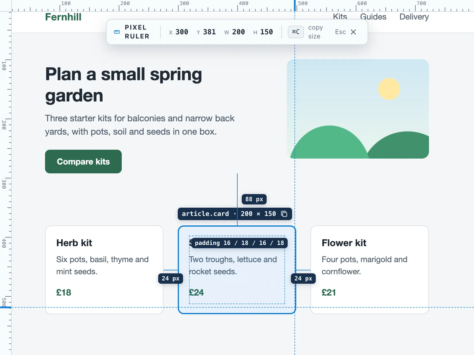
For these cases we make Pixel Ruler, a Chrome extension that draws a ruler over the page you are viewing. Start it with Measure this page in the popup under its toolbar icon, or with its suggested shortcut, Alt+Shift+M. Drag between two points to read the horizontal and vertical distance between them, rest the pointer on an element to see its width and height, or click the element to add its padding and the gaps to the blocks next to it. Shift locks a measurement to one axis, and arrow keys move the point by 1 px. It does not read page text or form fields and makes no network requests. Press Esc to clear a measurement and Esc again to close it. Its limits: it reports CSS pixels only, not centimeters or inches, and it works inside Chrome tabs only, so it cannot measure other desktop apps or windows. It will not start on Chrome system pages or in the built-in PDF viewer, and it cannot measure inside cross-origin iframes. It needs Chrome 116 or later.
Measure pixels anywhere on Windows with PowerToys Screen Ruler
Screen Ruler measures pixels anywhere on the screen, not only in a browser, and stops at the edges it detects. It is not built into Windows. Microsoft’s Screen Ruler page describes it as part of the Microsoft PowerToys utilities.
PowerToys needs Windows 11 or Windows 10 version 2004 (build 19041) or newer, on a 64-bit x64 or ARM64 processor, per the PowerToys install page. Microsoft recommends installing from GitHub or the Microsoft Store. With winget, the command is:
winget install --id Microsoft.PowerToys --source wingetPress Win+Ctrl+Shift+M to start it. A toolbar offers four tools, and Ctrl+1 to Ctrl+4 select them from the keyboard:
- Bounds: drag a box over the area. Hold Shift and the box stays in place until you cancel.
- Spacing: horizontal and vertical spacing at the same time.
- Horizontal and Vertical: spacing in one direction only.
Click to copy the measurement to the clipboard, and press Esc to close the ruler. If the ruler stops at the wrong edge, scroll the mouse wheel up. Each tick raises the threshold for pixel difference by 15 units. In PowerToys settings, raise Pixel tolerance for edge detection (0 to 255) to make it more forgiving with gradients and shadows.
A 2022 walkthrough gives a shorter shortcut, Win+Shift+M. The one on Microsoft’s page today is Win+Ctrl+Shift+M.
Measure pixels on a Mac
In Chrome on a Mac, use DevTools as described above. Outside the browser, the Apple support pages we checked describe no on-screen ruler. The closest documented tool is a screenshot of the area. The macOS User Guide says: “Press Shift-Command-4, then move the crosshair pointer to where you want to start the screenshot.” Then drag over the area and release.
To move the selected area without changing its size, press and hold the Space bar while dragging, per Apple’s screenshot guide. To cancel, press Esc. Otherwise the screenshot saves to your desktop.
Neither page says that the crosshair shows the size of the selection. The result is an image of the area you chose, measured in the image’s own pixels.
Those pixels need not match the CSS size of the same element. Apple’s design guidelines say “a point maps to a number of pixels that can vary according to the resolution of the display”, and give 2:1 as an example density for high-resolution displays. To see the ratio on your Mac, use the Console check in the next section.
Why two tools give different numbers
DevTools and a screen ruler count different pixels:
| Where the number comes from | What it counts |
|---|---|
DevTools tooltip and rulers, width in CSS |
CSS pixels |
| PowerToys Screen Ruler | Pixels on the screen |
| A Mac screenshot | Pixels of the image file |
Chrome’s device mode docs define the link between the first two: “Device pixel ratio (DPR) is the ratio between physical pixels on the hardware screen and logical (CSS) pixels.” In other words, DPR is how many screen pixels Chrome uses to draw one CSS pixel.
On Windows, display scaling sets that ratio. Microsoft’s DPI guide lists the standard settings as 100% (96 DPI), 125% (120 DPI) and 150% (144 DPI). In its example, at 144 DPI a 200 × 100 rectangle that an app draws “will be 300 × 150 physical pixels.”
A PowerToys feature request from 2022 describes exactly this case: at 150% scale, an element with width: 100px renders 150 px wide, and Screen Ruler reports the rendered width. Microsoft’s Screen Ruler page itself does not say which pixels it reports.
Page zoom changes devicePixelRatio too. The CSSOM View specification computes it from “the size of a CSS pixel at the current page zoom”.
Read devicePixelRatio at the zoom you measure at, or set the zoom back to 100% first. Chrome keeps Zoom in and Zoom out under More, at the top right, per Chrome’s zoom help.
To compare numbers, open the Console tab in DevTools, type this and press Enter:
window.devicePixelRatioMultiply a CSS size by the result to get what a screen ruler should show, or divide a screen-ruler reading by it to get CSS pixels. At a ratio of 1.5, 100 CSS pixels are 150 screen pixels.
Find your screen’s resolution and scale
On Windows 11, open Settings > System > Display, as the Windows display settings help describes. The Display resolution row shows the resolution, and Scale shows the percentage. At 125% or 150%, expect DevTools and Screen Ruler to disagree.
On a Mac, choose Apple menu > System Settings, then click Displays in the sidebar, as Apple’s display settings guide describes. In Chrome, the window.devicePixelRatio check above shows the ratio it uses on that display.